Design Wednesday
This will be a regular occurring post on the blog. I’ll link and talk a little about graphic and home design.
Design trends for 2014
Colour
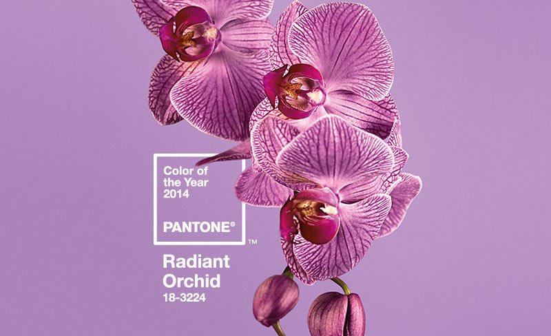
The Pantone colour of 2014 is Radiant Orchid, Pantone have said “The captivating, magical and enchanting Radiant Orchid. An invitation to innovation, modern and versatile Radiant Orchid encourages creativity and originality. Imbued with a harmony of fuchsia, purple and pink undertones, Radiant Orchid inspires confidence and its rosy undertones emanate great joy, love and health.” If you visit the Pantone site you will be able to explore and see more on how they select the colour.
Packaging
You may have noticed the trends in packaging design as of late. You cannot escape it, many companies are using it as an added part of their product. Sometimes it might be interactive, the material used has texture or tells a story relaying to the product. I could spend hours looking at packaging, and sometimes I feel it influences my purchases.
The trends in the last year or so have included super-geometric shapes, hand drawn illustrations, minimalist designs, and retro or vintage styles. It seems to be that photography heavy design is fading out a bit and we are being drawn to fresh, eye-catching packaging using warm, earth tones or pastel colours and a great use of typography. Below are some examples of each trend.
1. Geometric patterns (The Dieline)
2. Hand Drawn Illustrations (The Dieline)
3. Minimalist Design (Serif & Sans)
4. Retro/Vintage Styles (Bittered Sling)
Typography
The typeface trends of 2014 are from bold and large, to handwritten to retro/vintage. The big and bold typefaces are great for headlines and are easy to read. Handwritten can have a lot of personality and also can help convey the mood of where they are used. Vintage/retro typefaces give a nostalgic, modern feel.
1. Cubano (Lost Type Co-op)
2. Canoe (Fonted House via Myfonts)
3. Yorklyn Stencil (House)
Enjoy!


